The Anatomy of A High Converting Landing Page
1. The Hero (of your landing page)
The Hero (or the top section of your page) is THE most important part of your page.

In your Hero, you want the following components:
1. Headline
2. Sub heading or bullets
3. CTA
4. Image/video
As we talk about often on this blog, the main focus of your Hero is to provide clarity around:
- What it does
- Who it's for
- Why they need it
- How to get it
Answering these questions will help you generate the messaging you need to create effective headlines, subheadings, and your CTA.
Your image should be something that illustrates your product or service. Or in the case of a video, it explains how it works.
Bonus Hero Additions
👉 "Risk Relaxers"
👉 Social proof
These two are great additions to a Hero and something we usually incorporate in our own.
Common Risk Relaxers are:
- No credit card needed
- 30 Day Money Back Guarantee
- No contracts or commitments
Social Proof
- Quotes
- Photos of users + star rating
- Statistics
These combined with a solid, clear headline, subheading, and CTA can be a deadly combination.
This is your chance to show off some social proof early.
This should appear right below the hero in a "bar" across the screen.

These can take different forms for different businesses. Let's look at a few examples for different business categories:
Ecommerce: We like displaying top or relevant publications that have mentioned the product. This helps cement the product as something that's not just highly rated but trending.
Service Based Business: Since the service industry is heavily focused on ratings/review sites, we like to leverage 3rd party review sites like Google Reviews, Trust Pilot, and Clutch.
B2B Businesses: A lot of businesses want to make sure they're not the only one taking the leap. This is why showcasing other recognizable brands helps. Don't have big names? Share what you do have. You can also leverage G2 and Capterra ratings here as well.
Regardless of your industry, this section is a great way to reinforce trust with your users.
Now that we've provided some clarity and built trust with social proof, let's get into some of the benefits of our product or service.
In this section, we want to dig into the importance of "what's in it for me".
What does our product/service offer that will help the customer achieve their desired outcome (work less, stress less, make more money, etc.).
This section is fairly straightforward in terms of layout. We generally like text + image in either a checkerboard pattern (shown below).

Or in a consistent text + image format. I lately have leaned towards this format because I find it more pleasing to the eye and easier to consume information.

Benefits should be that - benefits. NOT features.
To clarify what I mean, here's a few examples:
"Combines all your apps in a single interface"
"Get designs in under 24 hours"
"Accelerate deals with automated sales messaging"
The key here is that you want to focus on your top 3-4. You don't want to bog your audience down in benefits.
Most people don't have the patience. It's also a good practice for you. As it forces you to get cystal clear on your best, core benefits.
For imagery or video, I'd keep the content themed to your benefits. Illustrations of UI or product close ups work best here.
Bonus Tip: Add background elements or overlays to add more visual interest to these sections. But don't overcomplicate.
Social proof can appear throughout your page. However at this point, we want to make sure it's the star of the show (or landing page).
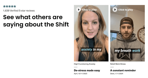
Social proof takes many forms: testimonials, reviews, publication quotes, quadrant rankings.
At this point in the page, you want to share a testimonial/quote from a highly relevant customer.
We recommend big text. That's fairly brief with something you can highlight. It's best practice to always accompany the quote with an image.
People like seeing faces and this adds more weight to the quote (someone was literally willing to put their face behind it).
If you have customers who are willing to provide video testimonials these are even better. We see this work especially well with our Ecommerce brands but we're pushing this more with B2B brands too.
At the end of the day, people trust other people. If you can provide a testimonial in written or video format, you've established another layer of trust with your audience.
The FAQ is your chance to list and answer your prospects' questions. Generally, we like to focus on the BDQs (buyer decision questions) our audience has about our product or service.

They will vary by your product/service/industry but generally these are focused around the following:
- Pricing
- Refunds/Exchanges
- Timelines
- How it works
- Expectations
- What's supported
- Advanced Services/Features
Here you can go into greater detail around each of these questions than what you may or may not have covered on your page. Length isn't critical. As a general rule of thumb. keep answers to 2-3 sentences.
Bonus Tip: FAQ's can help your page rank better with SEO as well as achieve a higher quality score with Google Ads. This is why it's critical to answer questions completely and focus on what people are asking about our product. I.e Talk to your customers.
The popularity of FAQs on landing pages is on the rise but we still see a lot of pages without them. Take advantage of this and get ahead of your competition.
Now let's close things out with the closing CTA.
Your closing CTA is your final shot at convincing your customer to move forward with an action on your landing page.
This is where another strong headline and clear CTA comes into play.

Here you have the option of closing with:
1. Outcome or Promise ("Start building a course 100% owned by you")
2. Prompt ("Ready to switch?")
3. Action ("Try it for yourself")
I tend to lean towards the outcome or promise since it's your chance to close. So why not close with the desired outcome?
You can amplify this by adding a time benefit (you're X minutes away) or outlining the steps (3 steps away) to your desired outcome.
Luckily you can test this and find what works best for your business.
While there are plenty of ways to build a landing page, sticking to these 6 structural elements will position your page for success. Focus on clarity in your Hero, finding the right mix of social proof and (bragging), be clear with your benefits, and close things out with a strong call to action.
Want a head start or help building your next landing page. We put together this Notion board of top brands and example you can use for inspiration.
P.S. if you need a little extra help, book a chat and we’ll show you exactly how we can help. We've built 100's of landing pages for top Fortune 500 brands and fast-growing startups.